We are proud of the quality of work our team has produced. Our websites are designed closely with your values and purpose.
We create simple and effective website experiences for you and your audiences.
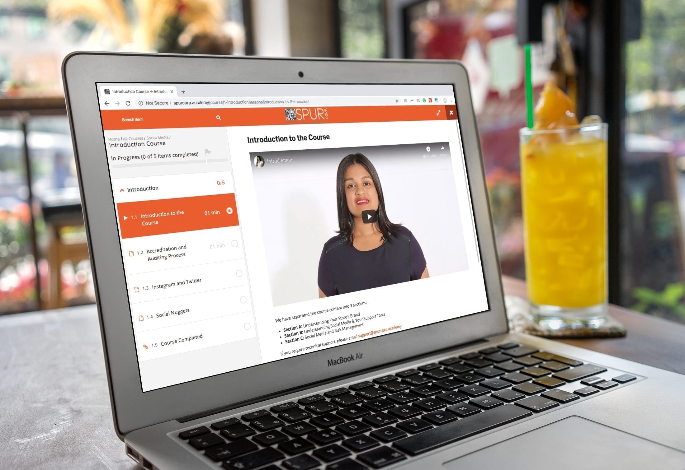
Spur Corp Online Academy
Spur Corp Online Academy
Problem
Spur Corp approached us to design an online training platform for their local and international service providers.
Solution
We built a secure, user-approval website that hosts various accredited courses. We developed all the learning materials including videos, quizzes and certificates. We are providing regular maintenance and management of this website.
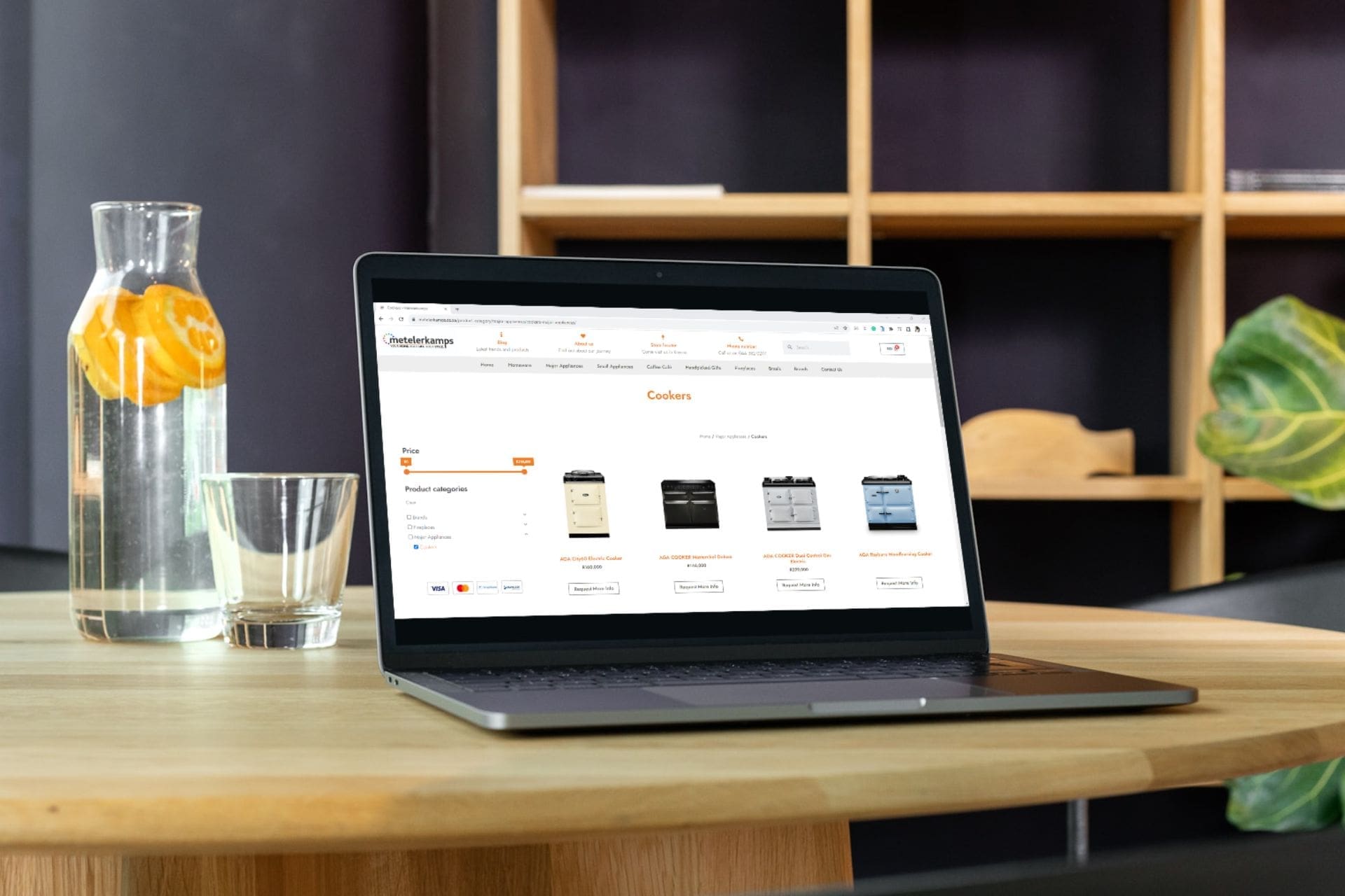
Metelerkamps is a busy kitchen and home store based in Knysna. The online shop was getting a lot of traffic but the user experience was challenging. The website also lacked speed and SEO optimisation.
Solution
We built a brand new website with a clean and modern feel. It is easy to use. The department or category pages are quick to explore your favourite items. We showcased their special services such as fireplace installations through out the website. It was important that we imported all orders and products from the old website for a smooth accounting.
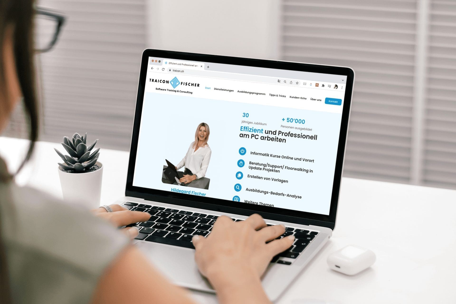
This client wanted to rebuild her website from scratch. She is very hands-on and was seeking a WordPress website that is easy for her to edit, is visually appealing, user-friendly and showcases all her online training courses.
Solution
Although our client was based in Switzerland, this was never an impediment to reaching her website goals and needs. All communication was done via zoom and email and the process was smooth and efficient. We loved the modern clean and crisp look of her site which translates very easily between German and English. We sent her personalised tutorials, and she can update her website’s content as she sees fit.
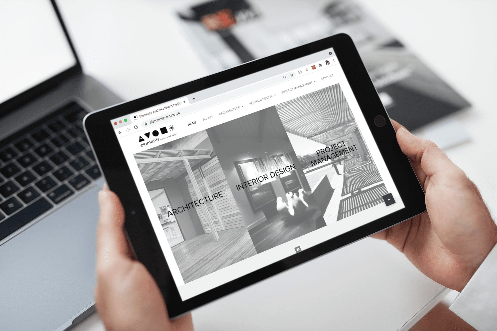
Marita’s architectural designs are purposeful, simple, efficient, and beautiful and that’s what she wanted her website to reflect.
Solution
We created a website with a block structure to allow each design to feel equal in merit and part of a system of services. The designs are clean, user friendly and showcases her work beautifully.
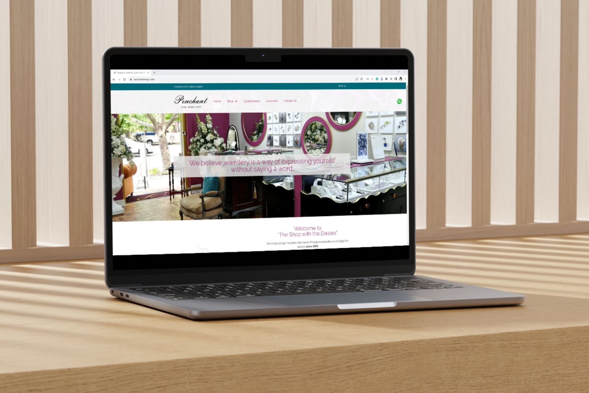
Jackie’s previous online shop did not represent her high-end brand. The design was cluttered and dated. Due to the age and multiple designers, the software was clumsy thus slowing down the website.
Solution
We had the pleasure of redesigning her fine jewellery website. It is luxurious and easy to use for her customers. The design is responsive on all devices. The currency convertor tool is usual for her international clients. We also added a custom code that adds an enquire button on high-value items.
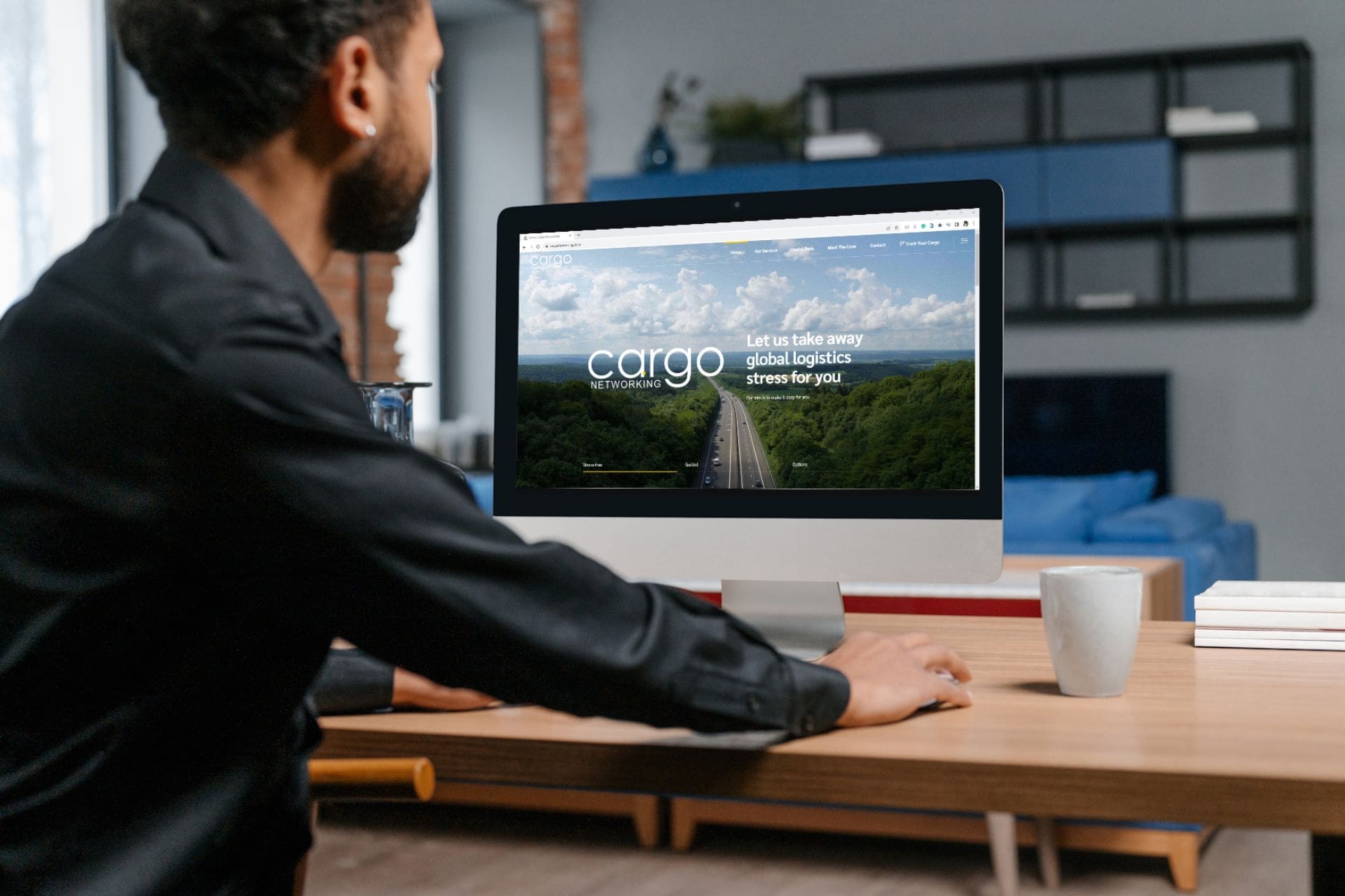
Pamela was looking to refresh the Cargo Networking website that showcase their logistic offering. Her old website was outdated and had many broken links.
Solution
We use bold imagery and fonts to create a confident brand. The website is well-organised and easy to navigate. The loading speed is quick and responsive.
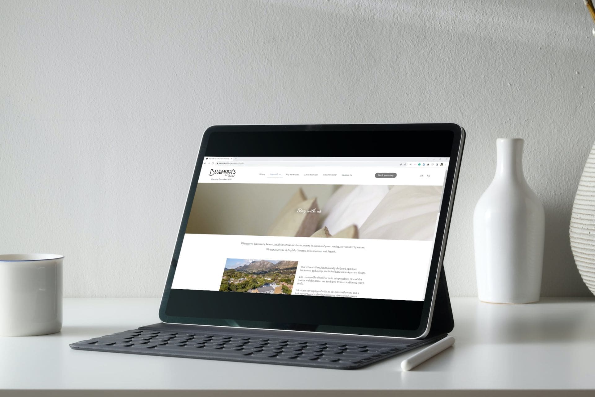
Jan was looking for a modern website for his new guesthouse in Hout Bay. The website should attract visitors from Europe travelling to South Africa.
Solution
We built a stunning website that highlights the features of their guesthouse. We also wanted to promote local and surrounding attractions. The website is translated into German and French through an easy-to-use switcher.
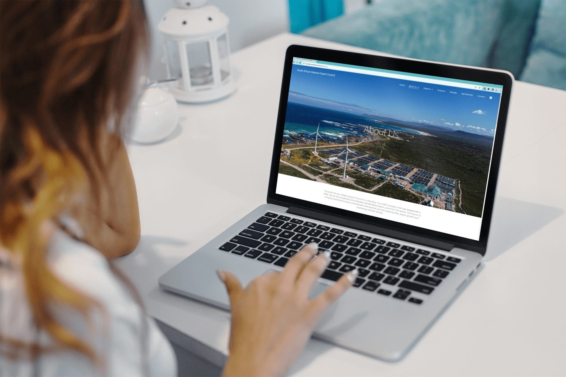
The SA Abalone Council had an outdated HTML website that didn’t reflect its new goals and objectives.
Solution
We focused a lot on minimizing words and maximizing images and videos. This helped transform the site into a visually modern, clean, and responsive website that showcases its main function – exporting abalone.
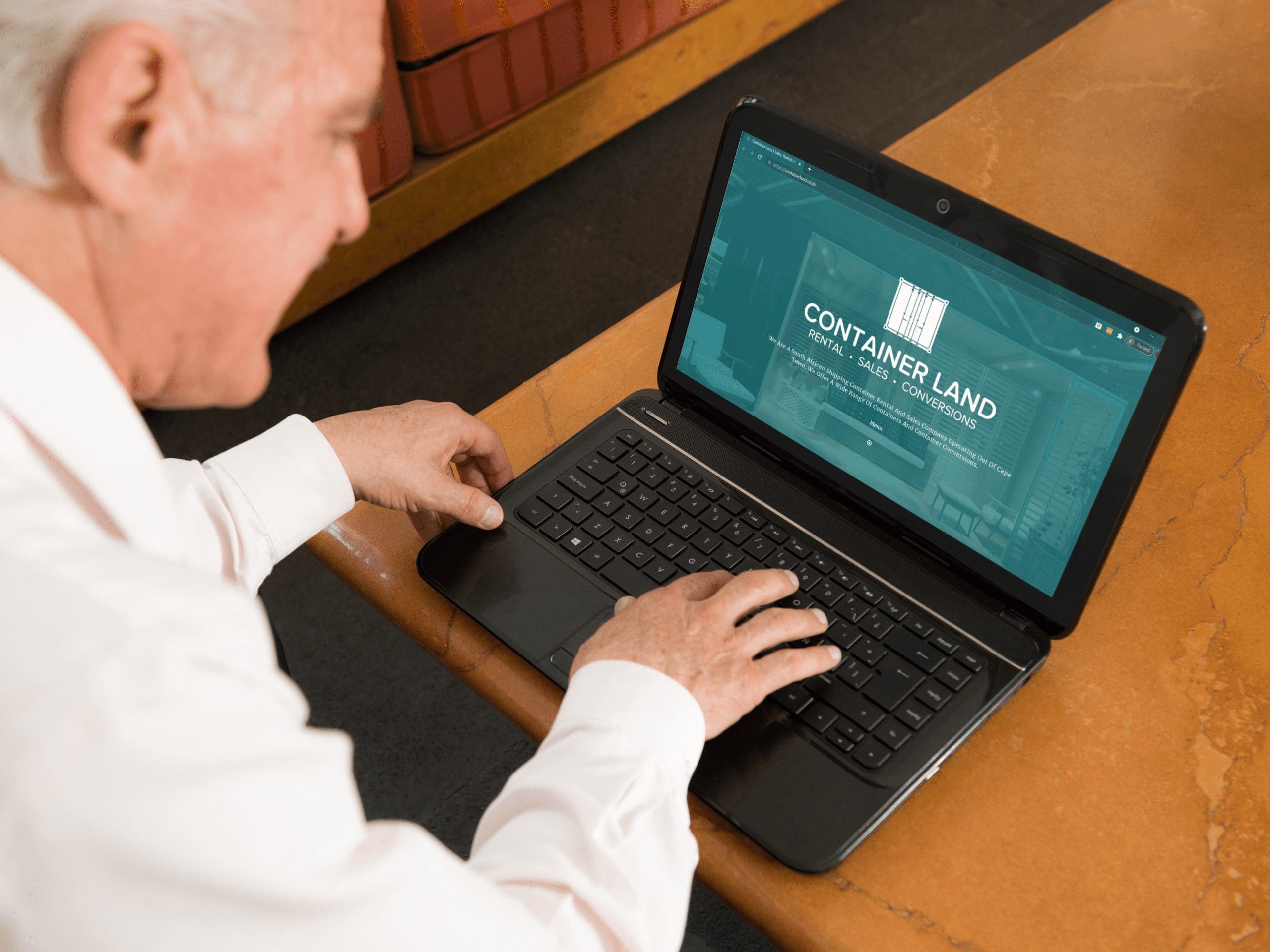
Container Land recently underwent a name change and wanted to update their project-heavy website to a more fresh, trendy one. They also wanted to place emphasis on all their services and not only rentals and conversions.
Solution
Showcasing the client’s innovative services on their new website was an easy feat as they had many photos gathered throughout the years. We animated elements on various pages and created a clean, modern look and feel using the latest fonts and graphics. This is not an online shop but can be upgraded to include a commerce element later, should the client wish to do so.
Thandi wanted an online presence so people could find out about her amazing coaching and consulting business. She wanted a website that is no-fuss and easy to use.
Solution
We built a simple yet effective website that highlights her programmes. We shot photographs of her at our offices to show her in action. The photographs added the extra sparkle to her website.
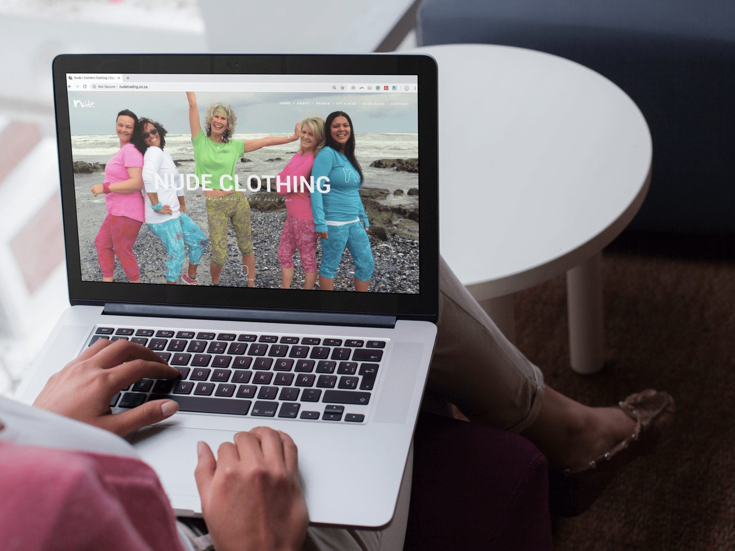
Gerda needed a showcase website to entice distributors or retailers to stock her funky live-in clothes. It needed to display her prints, styles and collection.
Solution
We created a bold product-focused website. It is image-heavy but quick to load. It works perfectly for cataloguing in an attractive way for distributors. A simple contact form is embedded for interested buyers to contact her.
Phumelele wanted a refresh on her website as she wanted to level up her business and book sales. Her old website was outdated and not responsive on devices.
Solution
We created an e-commerce website where clients can book and pay for consultations. It automatically syncs to her calendar to show availability. The website has clean colours: orange, white and dark grey.
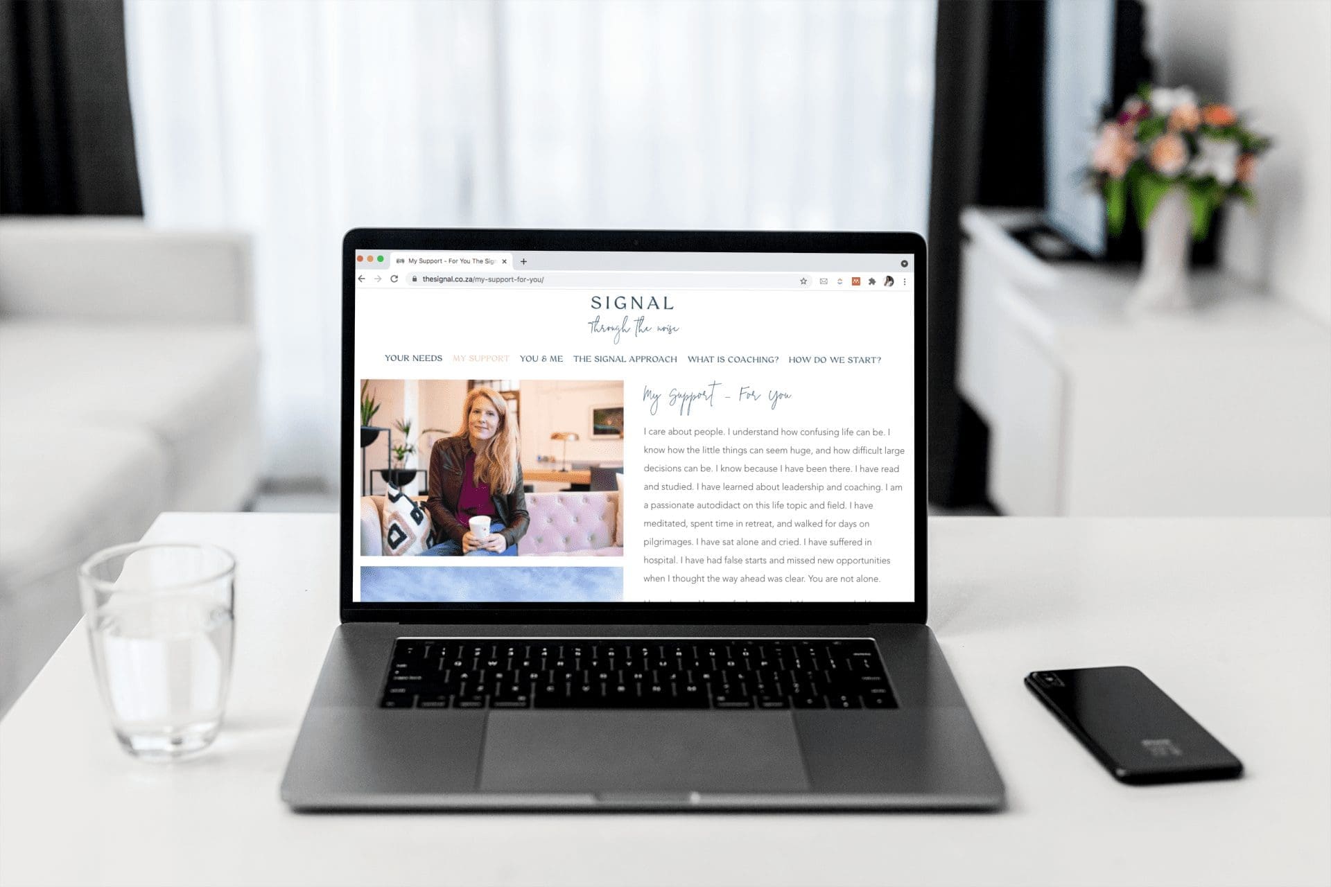
Sarah wanted a coaching website that will take users on a journey of inspiration, motivation and joy. She also wanted it to be the foundation for adding downloadable coaching programmes in the future.
Solution
We had amazing photos to work with and well-written content which all contributed to a building Sarah a clean, modern, and user-friendly website with clear call-to-action buttons. With some minor additions, her website will be ready to add training programmes soon after she records it.
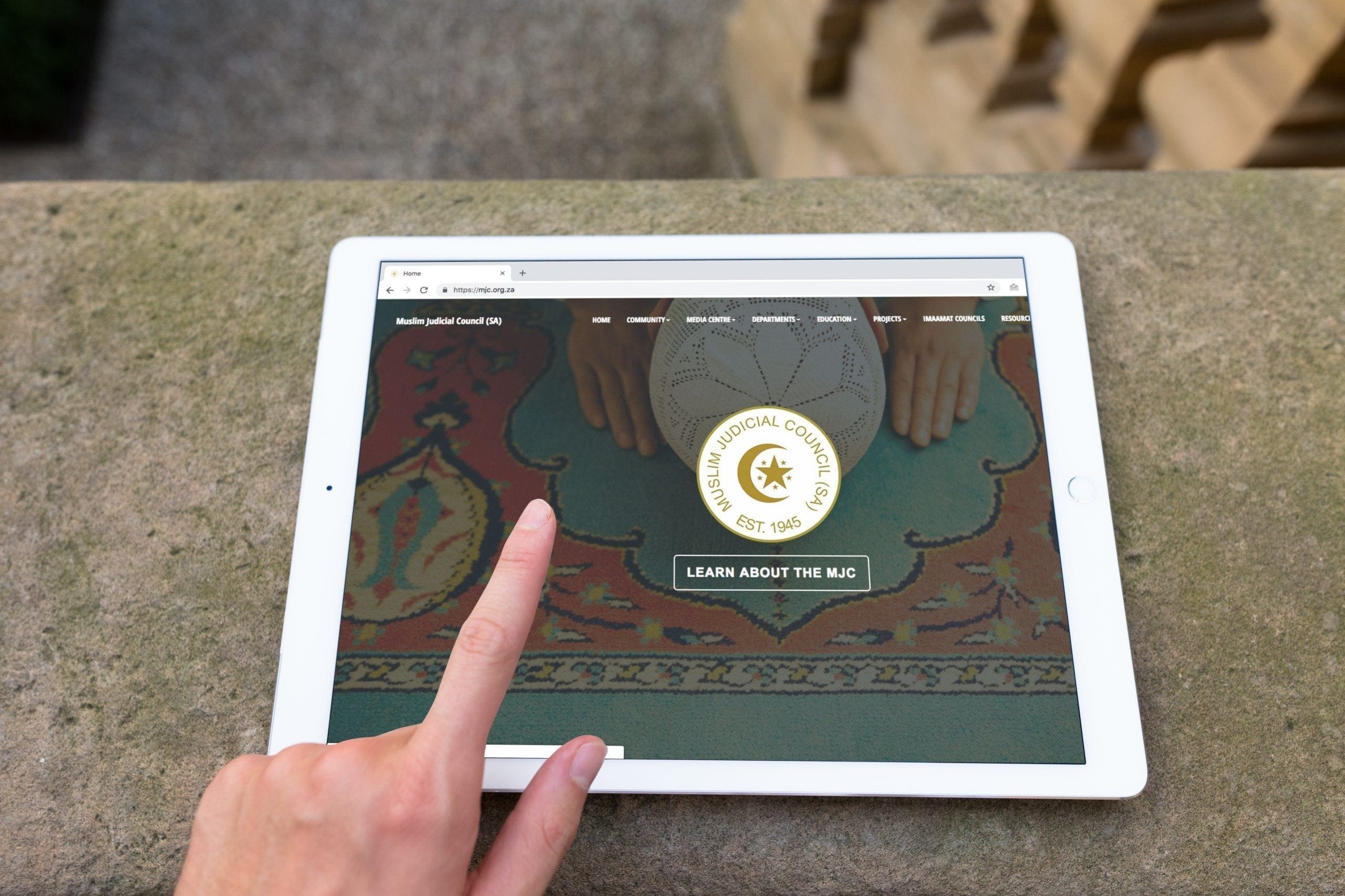
The MJC had quite a bit of informational content that needed to be showcased. All departments needed to be equally present. They clients and patrons range in age. They also needed a website that they can regularly update with press releases and news.
Solution
We built a stunning content-focused website. All content was copyedited to ensure a consistent tone across all department pages. The website is designed for it to be easy to use for an older generation and community. Thus there is no flashy animations, and mobile friendly. It is very light to limit high data usage.